Since 2000, every December Pantone announces the color of the following year.
Born as a technical standard to ensure proper communication and color reproduction between the experts, Pantone soon became a kind of “dictionary” and eventually a brand itself.
To choose the color of the year, for months team of professionals analyzes embryonic trends, drawing from various fields, from art galleries to street art, cinema, music, fashion and other socio-economic and cultural aspects.
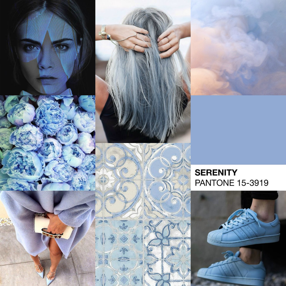
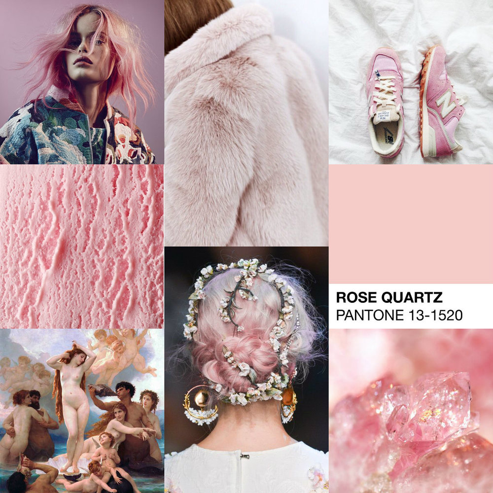
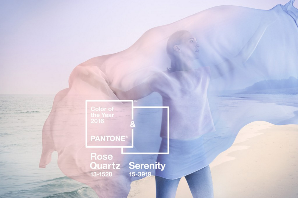
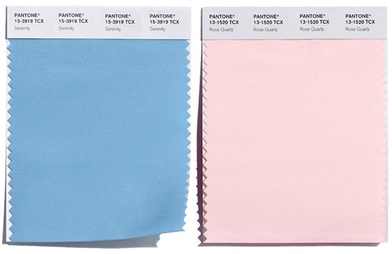
After years of individual and bright colors, unique and defined, this we have an ex aequo between two delicate and soft (maybe too much?) shades: Rose Quartz and Serenity.
According to Pantone’s experts, today people specially need to feel reassured, and these two colors have an inherent balance: the Pantone 15-3919 Serenity has the power to relax with its soothing effect, while the Pantone 13-1520 Rose Quartz, is a gentle but persuasive tone that conveys a sense of composure.
Well, welcome to the world of Little Ponies then.